How to Set Up a YouTube Channel for My Business
October 9, 2018
YouTube is the second largest social media outlet in the world. Other than Facebook, there is none larger. Getting your YouTube channel set up correctly is important for several reasons. First, it’s your brand. If you’re hosting your videos on YouTube, this is the primary way people will judge your ability to keep your brand intact. Second, it shows consistency. If you can demonstrate a high level of consistency within your brand, you’ve shown you have what it takes to stay organized. Do your clients want to know you’re organized? Our guess is they do.
What this post covers is what you’ll want to do past the initial set up. We know there are a lot of resources out there that will help you set up your channel initially, but once you have it set up, what should you do? This post will give you a checklist of sorts of what you should to do maximize your channel. Here we go!
Once you’ve followed the basics of setting up your channel, there are a few tips we’d like to share.
- Channel Art. You’ll want to set up channel art to give your channel a branded look. The recommended size right now (2018) is 2560×1440 px, with a safe area of 2048×1152 px. YouTube recommends a file size of 4MB or smaller. This helps in the load time and cuts down on their storage needs. NOTE: make sure any text or logos you want to have displayed is in the safe area. If you create the recommended size, there is a safe area within that every device (or at least a vast majority) will allow the viewer to see.
- Social Media Links. Once you’ve set up your account, you’ll want to link it to other assets, such as your website and your other social media pages. Currently, YouTube has a specific list of social media pages you can link to, including Google Plus or Google Pages, so you’ll want to make sure those are set up. Also, keep in mind these links, once set up, show up in the bottom right portion of the Channel Header Art, so keep that in mind when designing the header. If the social links cover important information in your art, like a phone number, it won’t be visible.
- Icon. Add the icon in the top left. It’s not always visible on every platform, but it helps to have it there. Most people use their logo, others use their head shot, but in the end, its up to you.
- Enhancing the Channel.
- Optimize the Description. You’ll want to write a brief, high-level description of what your channel is all about. It should use keywords and incorporate specific statements as to what the channel is about. Google’s algorithms have gotten pretty smart when it comes to text, so this is important. Don’t include statements that are unrelated and always have a call to action. The call to action might be to visit your website, watch a certain playlist or video, or call a phone number.
- Add Channel Trailer. A channel is less effective if it doesn’t have a trailer welcoming or describing the channel. You may not think you need one, but here’s why you do. When someone arrives at your channel, they may or may not know what your business is all about. They may not understand how your channel is organized or what is important for them to view to get a better understanding of who you are and what you do. The channel trailer will guide them or give them some reference as to who you are and why the channel is helpful to the viewer.
- Add Links to Channel. These links (described above) help Google verify and solidify who this channel belongs to, who it’s associated with, and builds the web of links you want Google to know and understand to improve your website and channel optimization.
- Playlists. Adding playlists is one of the ways you can tell your visitor you care about them. You’ve taken the time to organize your videos into bite-sized pieces to help them digest your message. Playlist are just that: a way of organizing similar videos and you should do it for a few reasons:
- Organization. We’ve said it once already, but this helps the viewer know which videos relate to each other.
- Get Discovered. When playlists are organized, YouTube (Google) knows that each of the videos in the playlists are related, therefore have a higher probability of getting discovered organically. When someone searches for a topic and you’ve titled a video with that search phrase, YouTube might bring up your entire playlist.
- Related. Again, because they’re related, the viewer can dig in as deep as they like to learn more about the related topic.
- Session Time. No, this is not the beer type of session, it’s the time they spend on your channel. If someone lands on your channel first (organically or directly) and then spend some time on your channel because they’re nosing around in similar videos, you get extra credit for keeping on your channel longer. Longer sessions usually mean credibility for Google/YouTube. Layer on top of that, YouTube will even reward you if you draw someone to your channel and then move off your channel to another channel. You get extra credit for bringing the viewer to YouTube (at one point, the entire session time they spent on YouTube was given to you, not all the other sites if they visited you first).
For a couple of examples, we’ve selected one channel that has some missing pieces (but otherwise might be ok) and another that does it very well. For starters, let’s look at the channel that is missing a few pieces. We’ve removed their logo and name to protect their identity.
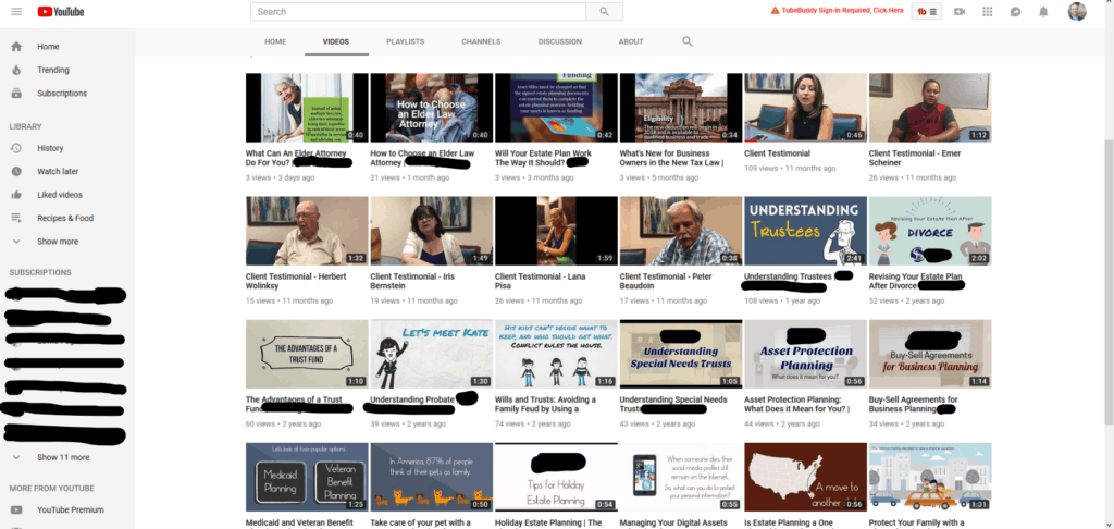
So here are a few points to consider on this channel. First, there is an inconsistent image for each video. You’ll see on the next example, how a consistent image can be created. Second, and this is something you can’t see in this image, they don’t have playlists created.┬á As a visitor, you might not know which video you need to watch, but if you knew that four of the list of videos were about a specific topic you came to learn about, you’d find it helpful. Third, the trailer did not have a call to action and did not incorporate a general message for the business. It was more of a moving PowerPoint presentation, which is fine, but less effective when it comes to getting the viewer to take action.
To see a good example of a YouTube Channel, we’re going to use our sister business My Video 101’s YouTube Channel.
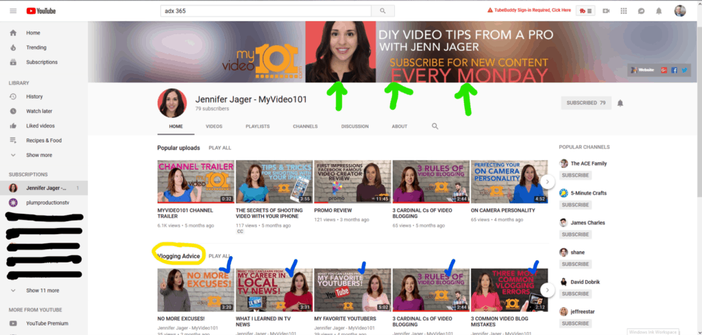
For this channel, we see some helpful things right from the start. First (green arrows), the header image is information about the channel and what to expect. For businesses, we recommend an image with a message that makes sense for your branding. On this example, we also see the social media buttons are set up. Second, this channel has playlists set up (see yellow circle). They use several: Vlogging Advice, Product Reviews, Technical Tips, and Behind the Scenes. Helpful if you only want to learn about one area of the channel, right? Third, this channel has consistent branding across all videos (see blue check marks). While each topic is different, each video looks similar, yet a little different. Consistency is pleasing to the eye and helps the viewer feel at ease when searching through the videos.
With just a few tweaks your YouTube Channel can improve your image and increase views. Take the time to set up your business channel the right way so you get the most out of your channel.
Sources:
DreamGrow (https://www.dreamgrow.com/top-15-most-popular-social-networking-sites/)
Gravity Search Marketing (https://www.yourseoplan.com/benefits-of-creating-youtube-playlists/)
YouTube Support (https://support.google.com/youtube/answer/2972003?hl=en-GB)
Buffer (https://blog.bufferapp.com/create-a-youtube-channel)
